Cars shopping redesign
From a non-responsive view to a fully responsive and accessibility compliant website
Overview
I led the design overhaul of the cars shopping path from a desktop-focused, non-responsive view to a fully responsive website. The UX team did a thorough competitive analysis, established a content hierarchy, evaluated several layouts, tested the short-listed alternatives in the usability lab as well as on usertesting.com and provided the finalized visual designs.
Background
The rental cars shopping path, since the early 90’s, was focused on users who shopped on their desktop or large screen laptops. With the increasing popularity of tablet and mobile devices we needed to:
ensure shoppers are provided with a consistent experience across their devices.
enable functionality to support additional use cases (i.e. one-way and off-airport pick-up/drop-off).
deliver designs that allowed users using assistive technology to navigate and shop.
support a single code base.
Other than the conversion metric (~3%) UX did not have any visibility into shopper behavior, click-thru rates and conversion funnel flow.
Our Approach
We conducted several usability studies to benchmark our site’s usability across our competitors: Priceline, Orbitz and Travelocity.
We did a teardown across these websites to establish a content hierarchy based on the job of the page.
Following this, we extensively sketched out different layouts (ranging from paper/pencil, wireframes to high fidelity mocks) to determine a framework that could scale across device sizes and how the different elements/content within the page would adapt. Engineers were also involved in the feedback loop to understand the technical capabilities and identify any roadblocks early on.
Several layouts were then prototyped and tested with customers in the lab as well as remotely.
Further iterations were made based on feedback and finalized designs were provided to the development teams.
Potential risks were identified and several design alternatives to mitigate risks were provided.
Old Layout

Results sorted by preferred vendor

Results sorted by price

Results sorted by car size

Car details
New Designs

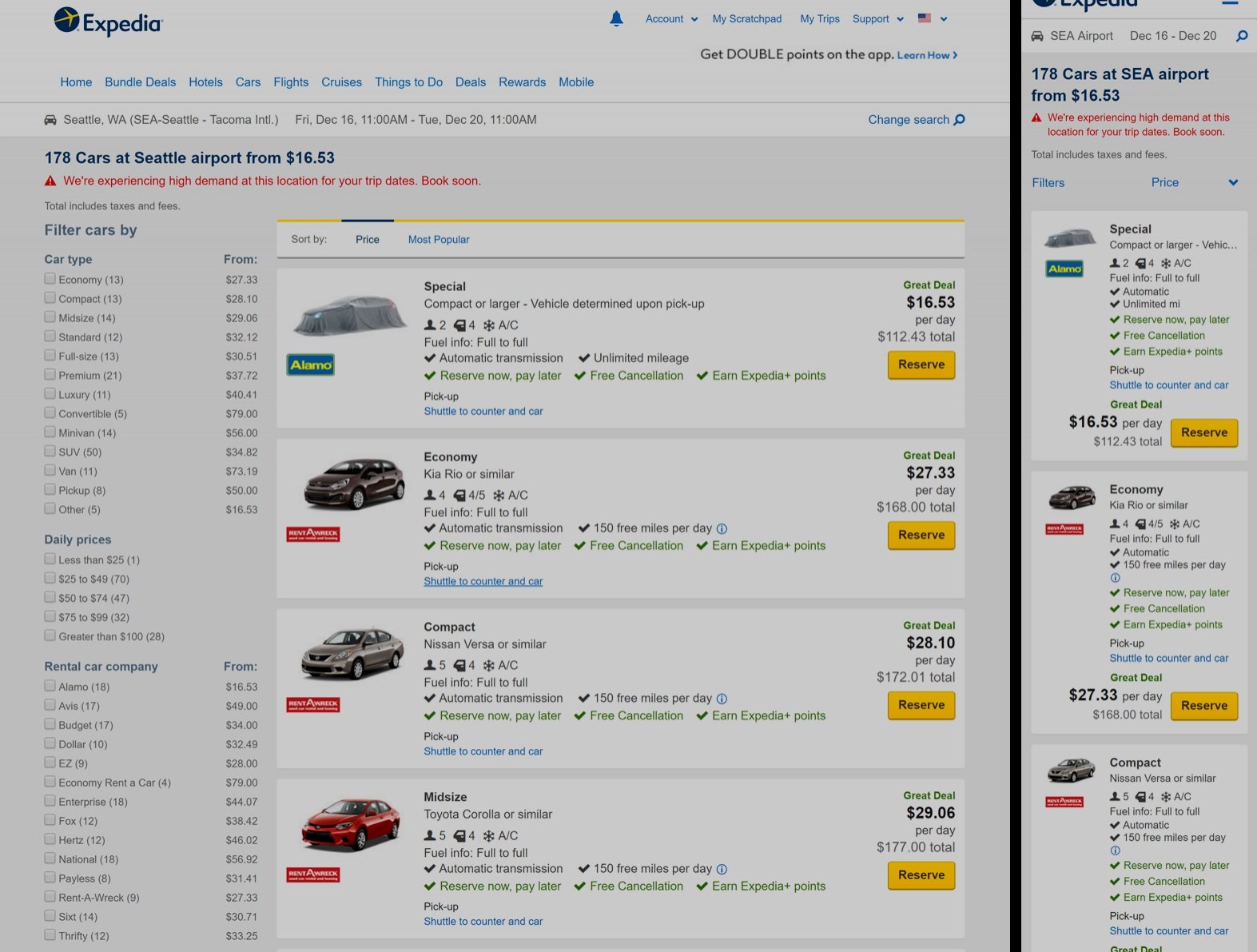
Cars search results - Desktop and mobile views

Cars details - Desktop and mobile views
Outcome
Conversion increased from 3% to 12% on desktop. Mobile conversion was 9%.
Built in tracking to understand funnel flow, engagement, click thru data etc. to get more richer insights into shopper behavior. This data was used to provide a backlog of test & learn ideas to further optimize the flow.